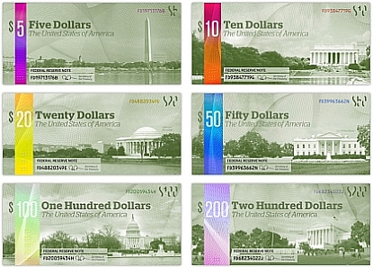
Anyway, in response to the The Dollar ReDe$ign Project, artist and designer Michael Tyznik created this lovely and relevant series of U.S. paper basing his design on the premise that our dough is "aesthetically lacking." American banknotes, he explains,
are in dire need of a redesign. Even though the green color of money is deeply interwoven into the nation's culture, the need for color differentiation between denominations has forced the inclusion of color. The recent redesign of banknotes by the Bureau of Engraving and Printing is poorly executed and aesthetically lacking. Because the coloring of the current notes is so subtle, it is still hard to differentiate between denominations by that method alone.
My proposed redesign keeps the culturally important green color of money, but introduces a brightly colored holographic strip into each denomination, making them easy to tell apart. This strip includes embossed dots for the sight-impaired as well, making currency far more accessible.

Although these elegant bills are a big improvement graphically beyond what's in your pocket, the artist's best innovation is on the reverse side:
One of the most important things about America is our Bill of Rights. It is possibly the most important information any citizen can have. The design of our money currently contains semi-religious (the eye in the pyramid) and overtly religious (“In God We Trust”) symbols and text that go against the incredibly important separation of church and state implicit in the first amendment. In my redesign, these are replaced with the text of the Bill of Rights. It has been proposed that these ten amendments are in order of importance, so it is fitting that the most important rights are included on the most common banknotes.You'll note that Tyznik also wants to recalibrate our money: The $1 bill, he says,
lasts only 21 months before it needs to be replaced. For this reason, I propose that the $1 banknote be eliminated in favor of the current $1 coin and a new $2 coin. For this reason, Washington is depicted on the $5. I also propose the discontinuation of the penny, because it currently costs more to produce one than it is worth. This is precedented by the elimination of the half-penny in 1857, after which the smallest unit of currency, the penny, had more buying power than today's quarter does.I think it's a measure of how seriously we need a redesign that Snopes had to go out of its way to deny that Treasury commissioned the project or planned to use it as a replacement for our current forms of U.S. legal tender.


No comments:
Post a Comment